
Guidehouse AI Studio Design System
A cross-functional design system that connects Figma, Figma Make, Storybook, a versioned React/NPM package, and the existing GitHub project template to help teams create consistent, accessible, and implementation-ready digital products.
Guidehouse AI Studio · Internal design-system initiative · 2026
The Problem
No design system, no owner. So we built one
There was no internal design system and little organizational priority behind one. Meanwhile, four groups across the organization needed a shared foundation.
Designers
One source of truth for components and standards
Developers
Components, tokens, and code they can ship
Business users
Early prototypes without waiting for a design cycle
Project teams
A starting point with the design system already in it
Constraints
- No internal design system
- No owner and little organizational priority
- Scarce developer resources, hard to secure
- Shared AI credits in Figma Make
- The existing GitHub template had to be respected
- AI output needs human review
- Role
- Product owner
- UX designer
- Dev management
- Team
- Co-designer
- 3 developers
- O&M team
- Corporate experience team
- Marketing
- Scope
- Figma library
- Figma Make kit
- Storybook
- NPM package
- Template integration
- Org-wide rollout
- Audiences
- Business users
- Designers
- Developers
- Project and delivery teams
- Employee experience
- Corporate management
- AI Studio, AI TMO, and supporting cells
My Role
Owner of the system, from strategy to rollout
Strategy and ownership
Direction, priorities, scope, and reuse rules
Resourcing
Secured scarce development resources
Dev management
Worked with the developers and followed the O&M handoff with them
Foundations and components
Color, type, spacing, and states, co-designed with a UX/CX teammate
Mentoring
Mentored and taught my co-designer
Documentation
Storybook, Figma guidance, and a SharePoint wiki
Alignment
Corporate experience team and marketing
Rollout and training
Office hours, walkthroughs, and the team's learning curve
AI testing
Installed the package with AI and tested it in VS Code
The System
Five resources, one design language
Each resource has one job and one audience.
Figma library
For designersReusable components and patterns
Figma Make kit
For business usersFast, on-brand prototypes
Storybook
For developersDocumented components, variants, and states
NPM package
For developersVersioned code and design tokens
GitHub template
For project teamsA consistent project foundation
Cleared up along the way
Not a separate template
The shared UI package is integrated into the existing project template.
Reference vs implementation
Storybook shows what exists and how to use it. The NPM package is the code.
The business-user route
Figma Make is the supported way for business users to prototype.
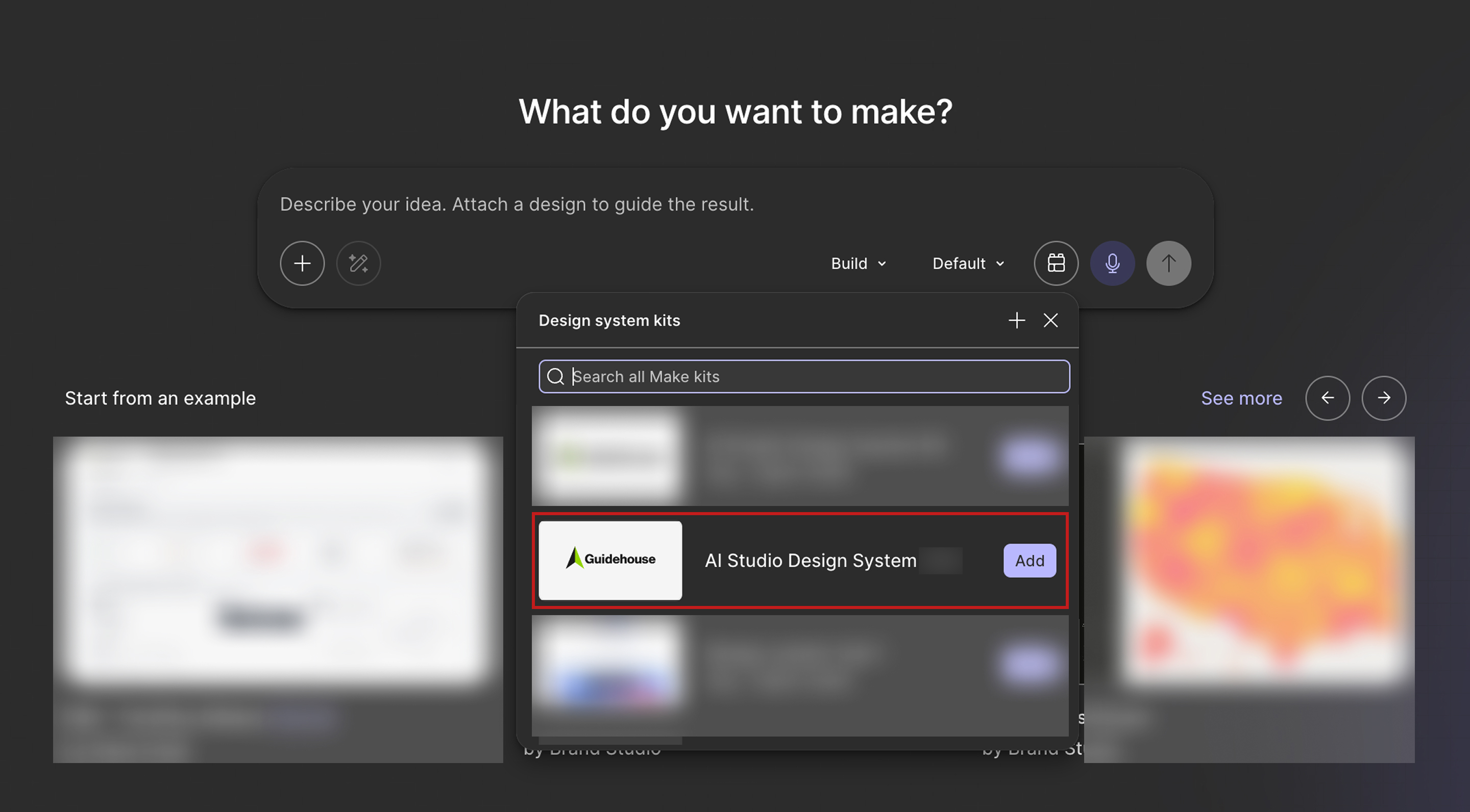
Prototype
Business users start in Figma Make
Add the kit, then prompt. Credits are shared, so efficient prompts matter.
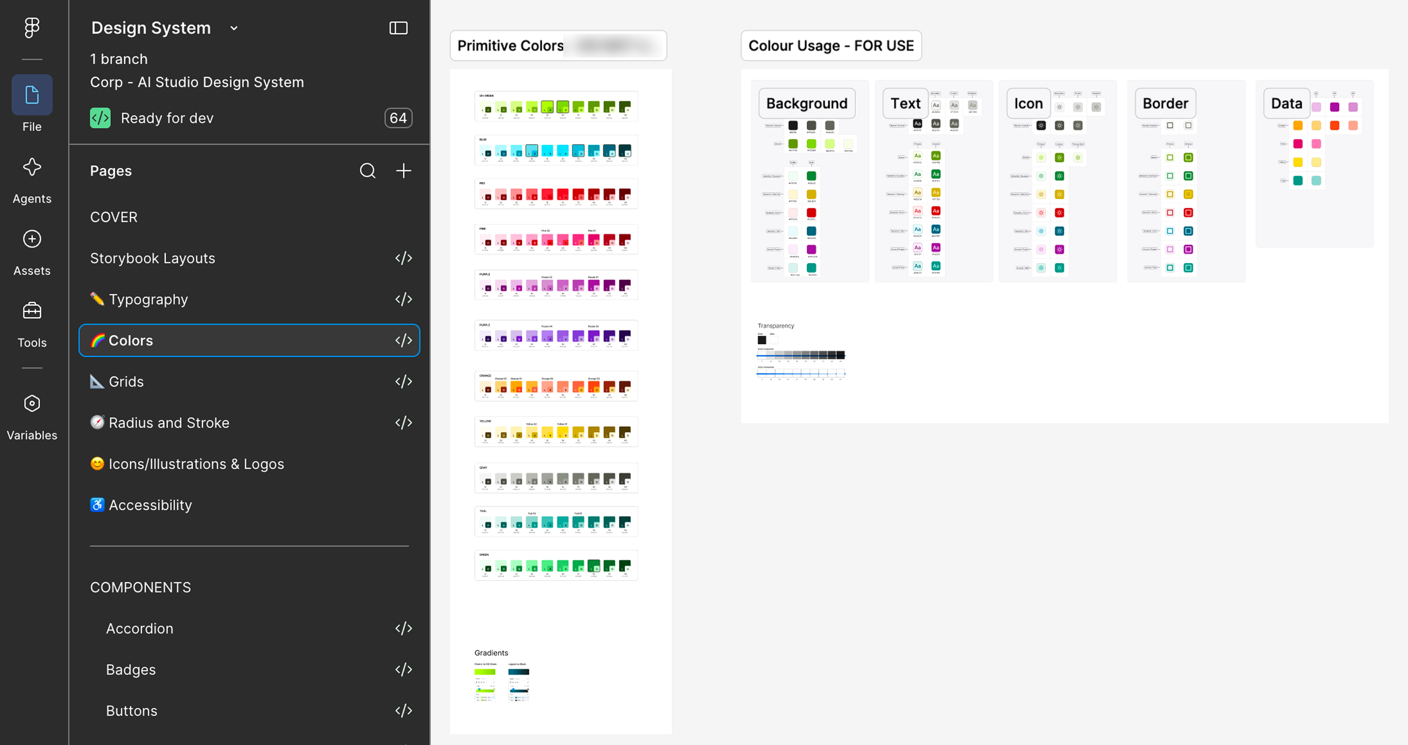
Design
The visual foundation lives in Figma
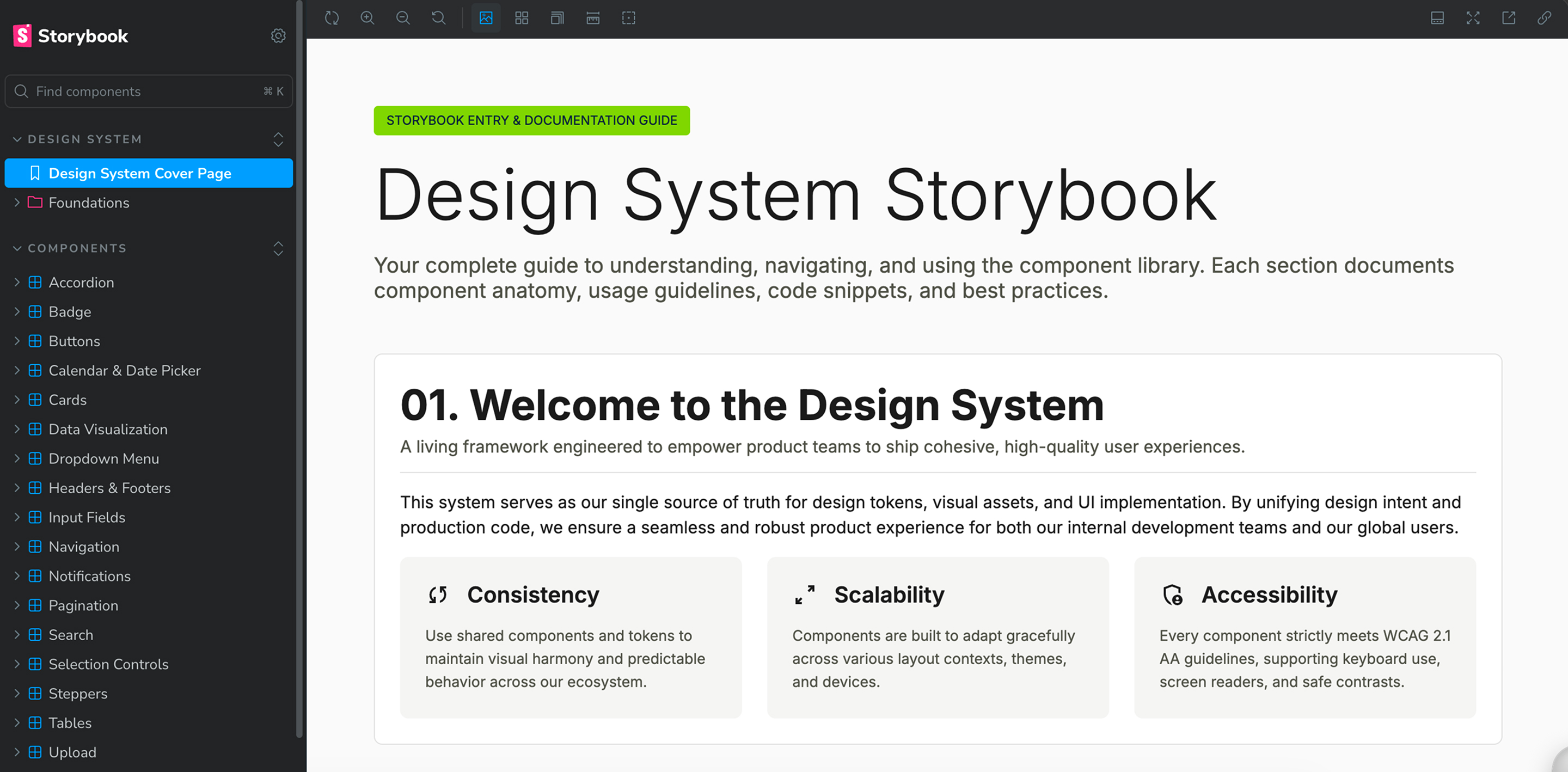
Documentation
Where developers check what exists
Each component documents its anatomy, usage, and code.
Build with AI
Developers build from the package
In VS Code, I had an AI agent install the NPM package, following the technical documentation. Then I asked it for an analytics dashboard “to test this design system.”
Rules and component metadata give the agent real context, so it stops inventing components, colors, and spacing.
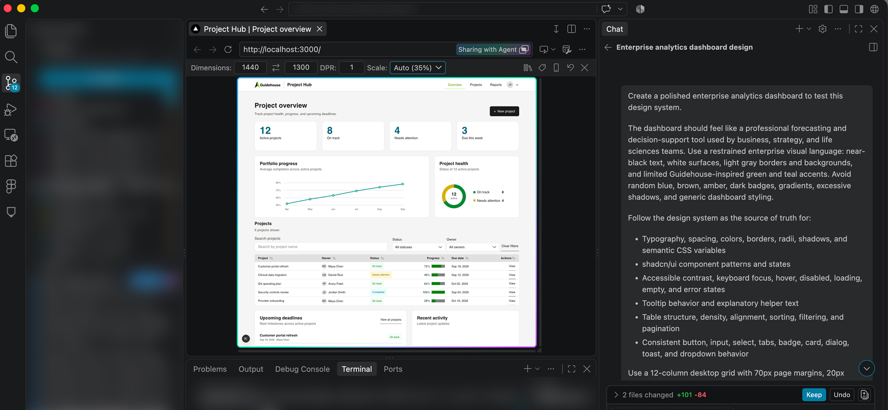
85–90%
On-brand accuracy in early testing. The output recognized the package.
Early internal result, not a formal benchmark
Distribution
From design files to a versioned package
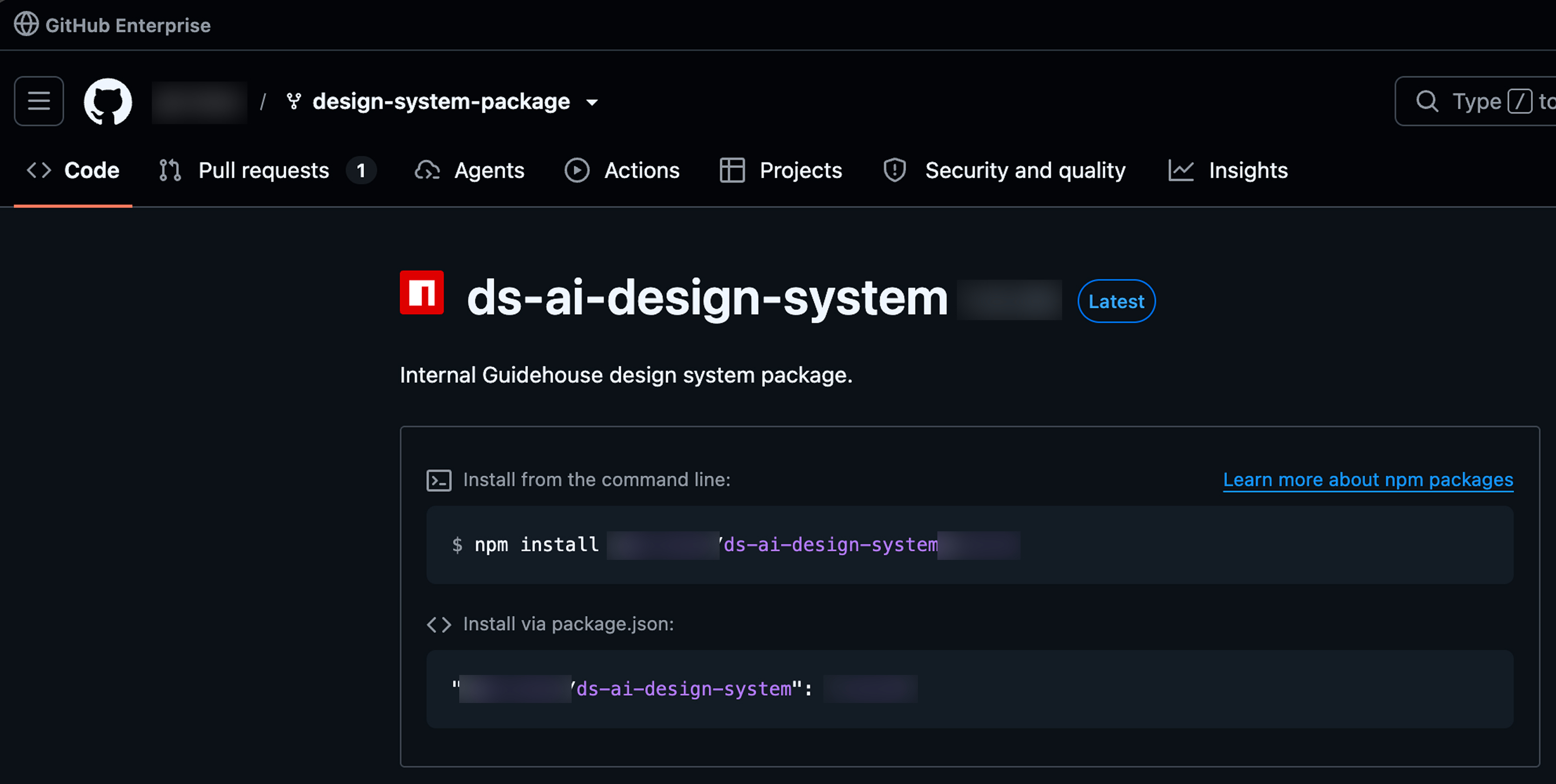
React and TypeScript package
One install command. Pin the version, so a team knows which release it builds on.
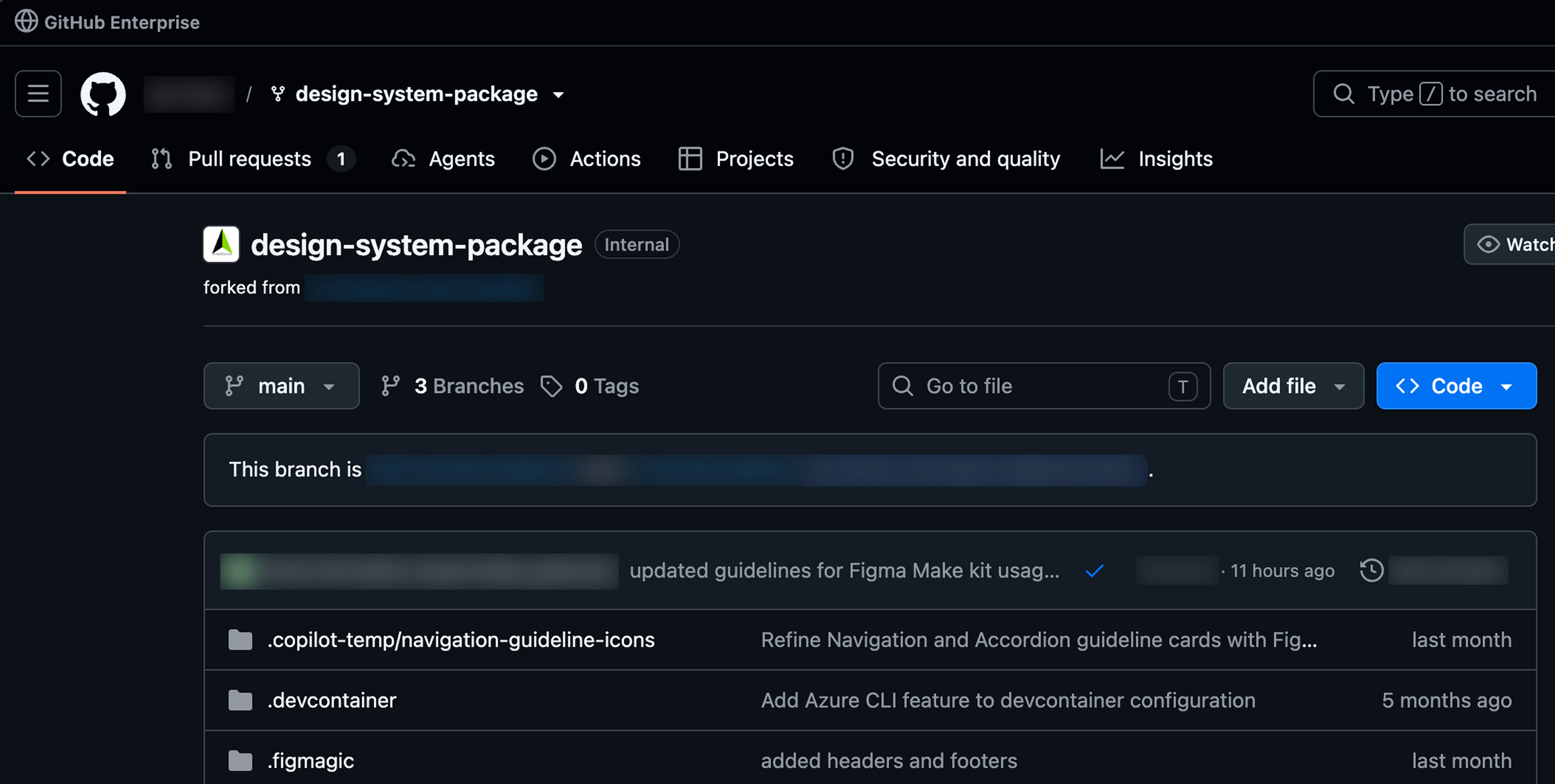
Repository and project template
The UI package is integrated into the existing template, so new projects start with it.
The Hard Part
The components were the smaller problem
No owner, no priority
Resources were scarce and hard to secure. I worked with the developers I could get and followed the O&M handoff with them
Different audiences
Role-based routes on one design language
Library to working system
Figma decisions had to reach Storybook, the package, and the template
Adoption over completeness
Office hours, a wiki, and rules for reusing or requesting components
Whatthesystemgaveteams
The five resources
- Figma library
- One source of truth for color, type, spacing, and components
- Figma Make kit
- Business-user prototypes built on the design system
- Storybook
- One component reference for designers and developers
- NPM package
- Versioned React code for development teams
- GitHub template
- UI package integrated into the existing template
Around the system
- AI context
- Rules and component metadata so AI tools stop guessing
- Accessibility
- Guidance for accessibility and component states
- Org-wide rollout
- Office hours, walkthroughs, and a SharePoint wiki
- Alignment
- Aligned with the corporate experience team and marketing
- O&M handoff
- Handoff to the O&M team, followed through with the developers
- Early AI test
- 85–90% on-brand accuracy in early internal testing